You can find her on https://www.renbehan.com/2014/03/storecupboard-spring-clean-recipes-bbc-good-food-magazine.html where she tells her story on what she’s written and about some of the recipes she added to the magazine. Ren has her own website, cookbook, and company where she writes about her work and offers many different ideas and recipes for unique foods to make.
Category of Typefaces Used
Serif and Monospace
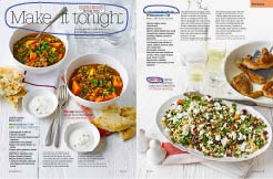
The typefaces used in this magazine are Serif and Monospace. The way you can tell that it is Serif is the title of the magazine has a stroke that finishes the end of the letter. You can also tell that it is monospace because the letters are equally proportionate and are spaced perfectly together horizontally.
Contrasting Typefaces
An element that makes the two typefaces contrast is the strokes at the end of the letter in the title. It makes the two typefaces stand out because it is only seen in the title and not in the paragraphs or section headings. Another thing that makes the two typefaces contrast against each other is that the subheadings are bolded and are either red or black where the title is thin lined and only black.
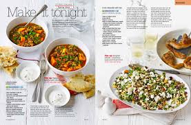
Photography Rule of Thirds

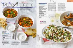
As we can see here the photographer did a good job in following and using the rule of thirds when they were taking the pictures for the magazine spread. On the first page the cup of soup is centered in the middle of the top left corner. And on the second page the salad is in the middle of the right and middle sections again drawing our eyes to it.
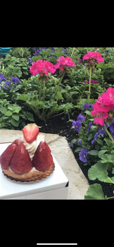
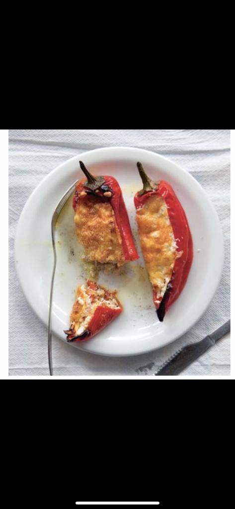
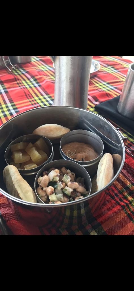
Alternative Photographs