

INTRO:
This ad was created by Target’s corporate office. Target was created by George Dayton in 1962 in the town of Minneapolis, MN. Stewart Widdwess designed the Target logo in 1962, but it was a little different though than what we all know as Target’s logo. It still had the red and white rings, but in the middle, it said “Target” in black, and then in 1968 they took “Target” out of the center of the rings. It started to become well known and nationwide in the ’80s-’90s. Target is most known for being an “addictive shopping” store, and most people who go in looking for one thing or nothing come out with a ton of stuff. Since Target opened it has become a well-known supermarket, clothing, household, and basically everything and anything you need store. https://corporate.target.com/about/purpose-history/Target-through-the-years
CONTRAST:
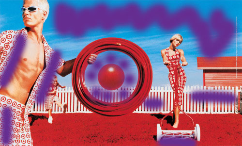
In this ad, we can see how the blue in the sky, white on the clothing; fence, and lawnmower stand out against the red, which is making all the Target logos stand out. Having the red logos against the blue helps draw your eyes to the red logo and thinking first of Target. And then the white helps to settle all the red down and also helps the Target logo appear in a more mellow way.
REPETITION:

In this ad, we see a few ways that repetition is used. The colors red and white are constantly being used whether it is for the logo, lawnmower, shed, lawn, and in many more areas of the ad. The logo itself is also being repeated all over the ad, on their clothes, as frisbees, and on a lawnmower. Anyone who knows what target is or has seen the store would recognize this ad, especially with all the repetition.
ALIGNMENT:

This ad is center aligned. As you can see when you first look at it your eyes are drawn to the middle. Center alignment is smart to use because our eyes are naturally draw to the center of what we look at. And having the center bullet of the Target logo sit on the fence makes it even more demanding for our eyes to notice and focus on.
PROXIMITY:

In this ad, we can see that proximity is well used. The dad and the frisbee seem like they are at the front of the ad, while the wife and son look like they are farther back. And the fence and shed are even further back. It helps give dimension and making things feel closer and farther away. But it also makes the center which is Target’s logo stand out the most.
COLOR:

Color is not a problem in this ad at all. The blue is helping ease the red as it is the main color of this ad. Target’s logo is red and white, and because these colors are used, it brings familiarity as most people know what Target is and what their main colors are.
CONCLUSION:
This ad demonstrates the use of all the principles; contrast, repetition, alignment, proximity, and color. With the use of these principles, it helps the ad show the Target store and what it is about without having to write/show any words on it. This ad helps people see that target is a lifestyle store, a family store, and a store that you can find anything you need without writing it on their ad. The use of the design principles makes this ad welcoming and homey which makes people want to go shop at their store and feel excited to go their with their kids or spouse.
